Let's fix FFXII's save UI
Posted
I don’t know much about good user interface design. I’m not quite User Inyerface clueless, though I’m probably not far off either. But stick with me here, because what follows is an example of bad UI that should be obvious enough that anyone would say “yeah, that’s some bad UI.”
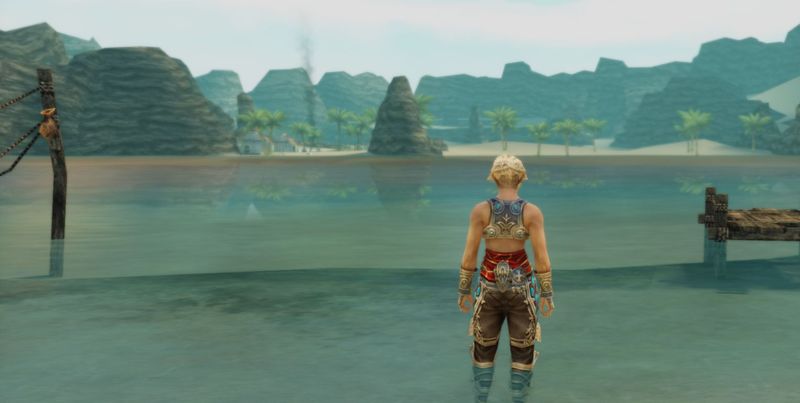
Let me start by saying that I absolutely adore Final Fantasy XII. I’ve only played through it 1.5 times, but I would defend it to death just the same. It breaks enough established (and bad) Final Fantasy-isms that it stands out from the rest. It has the least annoying battle system, the most intriguing world, and even the most beautiful music of the entire series. Yes, the awkward FF dialogue is still there, but for once it actually seems intentional. I firmly believe it to be the best Final Fantasy game ever made.
The 2017 PS4 remaster The Zodiac Age takes the best game in the series and improves on it. But one thing about it that bugs me enough to write the upcoming diatribe is the way it handles loading and saving. It sounds petty, I know, but considering how often you’re likely to save in this game (and load, if you’re the perfectionist type), it’s a tiny annoyance that becomes quite significant with time.
In contrast to the original PS2 release, the remaster uses the PS4 system UI for all its load and save menus, so they’re inherently snappy and readable. These menus don’t gel with the in-game UI, so it’s a bit of an immersion breaker, but it’s not a major issue if the interactions within them are brief.
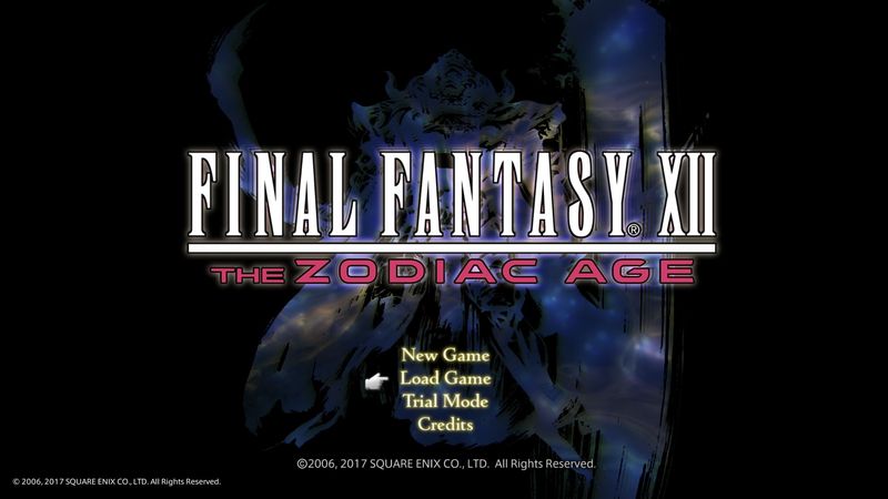
Let’s start by taking a look at how loading a game is implemented. When you start the game, you’re dumped into the title menu, which looks like this:
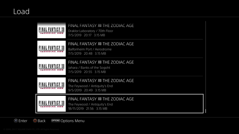
Choosing load game instantly brings up a list of saves, with the most recent one preselected. Neat! So far this looks pretty good!
But it only goes downhill from here. Choosing a file brings up the following prompt, asking you if you really want to load this save, with No preselected.
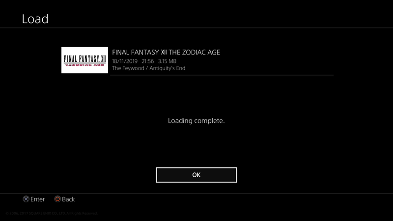
Select Yes and the file is loaded, after which you’re greeted with the following message.
Past this, you’re finally in the actual game part of the game. Alright.
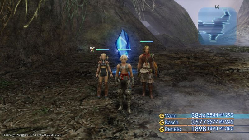
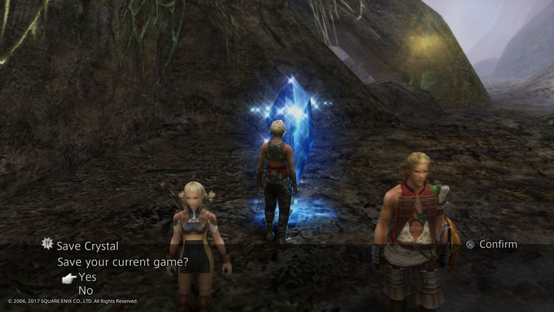
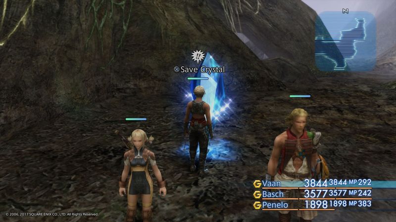
Let’s say that while playing the game, you come across a save crystal and you decide to save your game manually. Now, the remaster does feature autosaving, but if you’re anything like me, you wouldn’t want to rely solely on autosaves for a long RPG like this. As you touch the crystal, you’re asked if you want to save.
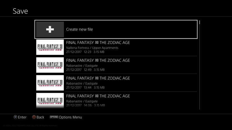
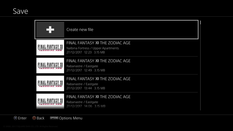
This prompt was part of the original game and has been preserved in the remaster. Choosing Yes brings up a list of saves with the additional Create new file option preselected.
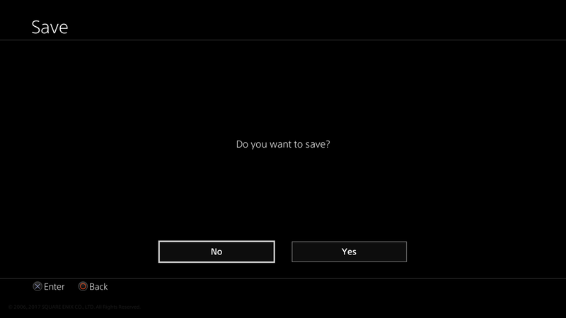
Both creating a new save and overwriting a previous one makes the game ask for confirmation, with No preselected, presumably to prevent accidental overwrites.
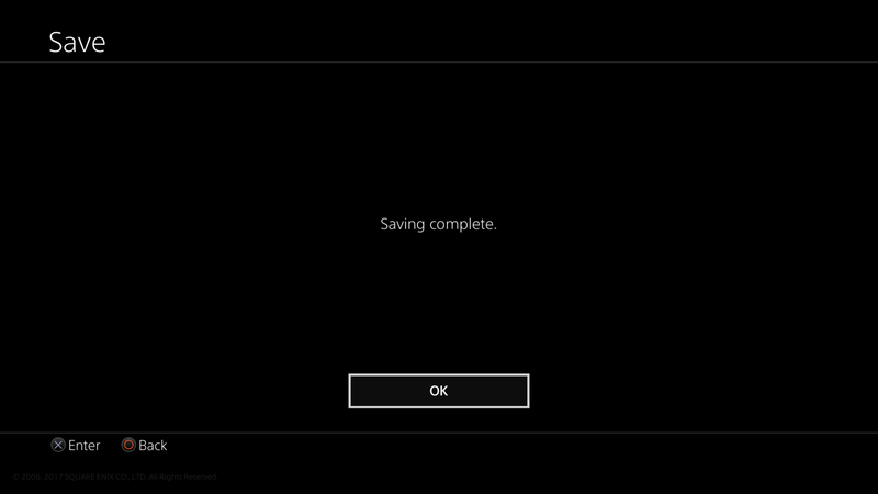
Choosing the Yes option performs the actual save operation, followed by a message confirming it.
Skip that and you’re back at… the list of saves.
You now need to press Back to exit the menu, and finally you’re free to proceed where you left off.
By now I hope you’re thinking the same thing I am. That’s a lot of unnecessary button presses for what should, ideally, be as quick and easy as possible. Let’s make some optimisations for these scenarios.
Drop the prompt after selecting a file to load
It’s only possible to load games from the main menu so there’s no chance of losing any progress by loading at the wrong time. Loading a save doesn’t modify it, and the load times are only a few seconds, so the benefit of this prompt is non-existent.
Drop the loading complete message
The player will generally know that their chosen save has been loaded when the game transitions from load menu to loading progress bar to in-game. Had the load times been much longer, this message might be used to prevent the player walking off during load and coming back to an unpaused game, but that’s really not the case here.
Don’t ask for confirmation when making new saves
It’s absolutely a good idea to prompt before making destructive operations like overwriting previous save files, but accidentally creating a new one is both non-destructive and easy to undo.
Drop the saving complete message
There’s a noticeable progress bar when saving which should hint that the operation is in progress, and silently transitioning from a progress bar to what the player was previously doing should imply that it completed successfully. This is perhaps more of a gray area than the loading complete message, but I still feel it could be dropped without much risk.
Close the entire menu after saving
Instead of reopening the list of saves, go back in-game to let the player continue. Going back to the list makes sense in a hierarchical UI system, but it doesn’t really fit the use case here. Interaction with the save menu is generally a one-off every time, so when the operation has completed, most players will have no further use for it but still have to manually close it. Assuming everything went well, the player’s priority after saving would be to either continue playing or quit the game, and the save menu assists with neither.
So there it is. We’ve fixed this tiny part of Final Fantasy XII: The Zodiac Age and made it much less annoying to use. It gets out of the player’s way and makes them spend as little time as possible in immersion-breaking system menus.
